Wes Anderson is a cinematic force who has marked his territory with his quirky and authentic style, making him one of the most recognised modern auteur directors, amongst some of the greatest directors of all time, from the likes of David Fincher, Quentin Tarantino, Martin Scorsese and Alfred Hitchcock who have all contributed into shaping modern cinema.
The hazy-hued colours of which our eyes are blessed with, render deep into his dream-like retro imagination and we delve into the director’s unique world that casts a nostalgic tone in every one of his films. The colours in each film become their own visual language and characters that we grow to love. It’s hard to imagine 2014’s The Grand Budapest Hotel without it’s signature vibrant pink trademark. Likewise with Anderson’s clever use of colour to represent time, from the 30’s, 60’s and the 80’s. These eras differ in two main ways, as mentioned before colour plays a huge role and so does the aspect ratio which changes throughout the film to demonstrate the change of time and visually reflect moments of cinematic history. (He is a visionary.)

The first part of the film take place in the 1980’s with an aspect ratio of 1.85:1, which is the standard widescreen ratio used today. We are transformed back into the 60’s, marking a change in the ratio, 2.35.1 – an even wider screen ratio that was popular in the 60’s but is still used in the present day. Finally we are taken back into the 1930’s, the central era of which the story takes places, shown in 1.37:1. This was the standard format for studio films back in the 30’s. Anderson uses The Grand Budapest Hotel’s ratios in way that makes the audience travel back in time and educate us. By choosing to go against the norm of traditional mainstream cinema, Anderson emphasises the themes his films present to the ratio from adventure to nostalgia, however he isn’t the only director to use aspect ratio creatively. Many filmmakers use it to symbolise the idea of restrictions and a lack of freedom the characters are feeling within articular moments, as shown in X avier Dolan’s ‘Mommy’ (2014) which uses a 1:1 ratio – a square, however during some scenes the screen expands to a 1 .85:1 widescreen to show hope within the character. Although this might somewhat be seen as pretentious as the 1:1 ratio resembles the boxed-in style of Instagram photos and videos, it is definitely an authentic choice. Another director that uses aspect ratio as a massive “F YOU” to Hollywood is Gust Van Den Berghe in his film ‘Lucifer.’ (2015) He cleverly uses a circular frame to as he stated “to create a paradise.” Pretentious or not, directors such these are finding success in the challenging mainstream cinema by rebelling against the rules and the result is phenomenal. Experimenting with aspect ratio gives filmmakers the freedom to present a wider range of messages in a unique and original way.
Another prominent feature that visually transforms the mood as well as time is the use of colour, and with the help of his director of photography, cinematographer Robert Yeoman, Anderson’s wild imagination is brought to life, giving way for audiences to recognise him an auteur due to his distinctive style. The 80’s is given a natural look with colours that are not saturated. Fast forward (or rewind back, whatever floats your boat) to the 60’s and immerse yourself in yellow, brown and orange tints that give off a warm tone to the film’s retrospective aesthetics. And finally, the 30’s are drenched in saturated, harsh reds and pinks, this use of over-saturated candy floss colours present a sense of longing for the past. Truth be told, The Grand Budapest Hotel is very hipster’s wet dream and each scene is a painting that demands to be captured and preserved.

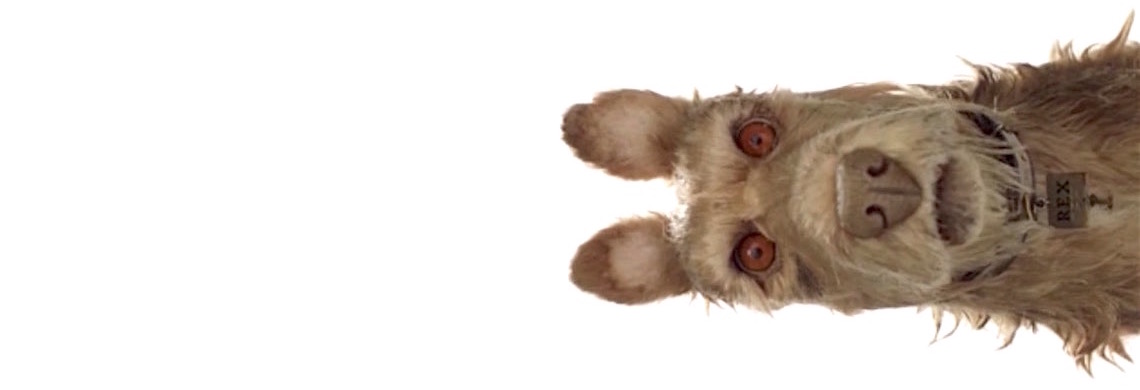
With the much anticipated release of his upcoming stop-motion animated comedy film, Isle of Dogs which is coming out in 2018, I have a few predictions as to what will be in store.
- A warm colour palette, drenched in yellow and red, orange tones. (It’s safe to say that Anderson is obsessed with yellow and red. Like crazy obsessed. These tones are in almost all of his films)
- A story of adventure with splashes of love and jam packed symmetry – another one of Wes Anderson’s obsession. All of his films are symmetrical or central. I enjoy his use of symmetry mostly because it makes everything look neat and demands you to focus on one particular thing.
- Dare I say it .. but death to a cute loveable dog. D UH! Wes Anderson has a thing for being ruthless when it comes to the death of animals in most of his films – especially dogs. Let’s take a trip down (a painful) memory lane, Moonrise Kingdom’s Snoopy – a brave soul, was s hot and killed with an arrow . In ‘The Royal Tenenbaums’, Buckley survives a plane crash, and you’re fooled into thinking he is safe until the end of the film when Eli, played by Owen Wilson, is high on mescaline and crashes into the Tenenbaum house and kills Buckley. THE HORROR.
The question on everyone’s lips shouldn’t revolve around the plot/story of the Isle of God but really, it should be how many more dogs will meet their demise at the hands of Wes Anderson? Let the animals live.
‘The Genius of Wes Anderson’ is an article written by Cynthia Vera. She regularly writes articles on her blog and gets carried away reblogging cool things from her tumblr.

